Mobile Survey Best Practices: Designing for the Thumb-First Generation
Master mobile survey best practices to engage the thumb-first generation with responsive, intuitive, and high-converting designs.

Introduction
In a world where screens shrink and attention spans dwindle, crafting surveys that align with modern habits is more essential than ever. Welcome to the thumb-first generation, a new wave of mobile users who navigate life, and surveys, one thumb at a time.
Surveys have evolved from paper and desktop formats into interactive mobile experiences. However, a simple screen-size reduction isn't enough. It demands rethinking question design, interaction zones, readability, and user psychology. This blog post explores mobile survey best practices designed specifically for today’s thumb-first audience, helping you drive better completion rates and richer insights.
Understanding the Thumb-First Generation
The thumb-first generation refers to users who primarily use one hand, and more specifically, their thumb, to operate smartphones. Their interaction pattern creates a unique ergonomic zone on the screen, where ease of tapping is essential.
A few traits of this audience include:
- Predominantly mobile-first users
- Expect quick, seamless digital experiences
- Prone to abandonment with clunky UX
- Intolerant of slow load times or tedious input
Understanding these traits is crucial to optimizing mobile survey design. Misalignment with user behavior can drastically impact survey effectiveness.
Why Mobile Survey Optimization Matters
A poorly optimized survey can be frustrating, imagine needing to pinch-zoom, scroll endlessly, or type out responses with difficulty. It’s a surefire way to lose valuable respondents. Research shows that over 60% of survey traffic comes from mobile devices. If your design ignores mobile users, you risk skewing your data.
Optimizing for mobile:
- Improves engagement and response rate
- Reduces survey abandonment
- Enhances data quality through more intuitive input
- Expands your respondent pool
For insights on when to use matrix questions effectively, visit Matrix Questions in Surveys: When to Use Them and When to Avoid Them.
Key Principles of Mobile Survey UX
To connect with mobile users effectively, surveys must follow basic UX principles fine-tuned for small screens.
- Minimalist Design: Less is more. Limit distractions.
- Visual Hierarchy: Highlight important elements with color and size.
- Consistent Layout: Avoid shifts and changes between pages.
- Feedback Cues: Use progress bars and confirmations.
- Touch Targets: Buttons should be at least 48px tall for thumbs.
For strategies to leverage real-time feedback in mobile surveys, check out Real-Time Survey Results: Why Instant Feedback Matters in Fast-Moving Businesses.
Designing for One-Hand Use
Survey elements must be comfortably accessible to a user holding their device in one hand. The ideal "thumb zone" lies in the bottom two-thirds of the screen, particularly the center.
Tips for designing with one hand in mind:
- Place navigation buttons near the bottom
- Use vertical stacking of options
- Avoid edge-screen elements
- Keep forms short and simple
Mobile-Friendly Question Types
Some question formats simply work better on mobile. Instead of overwhelming the user with long dropdowns or open text, use interaction-friendly formats.
Keep It Short and Sweet
The shorter your survey, the higher your completion rate. Mobile users are often on-the-go, and even minor delays lead to drop-offs. Aim for under 5 minutes or 10 questions max.
Use language that is:
- Simple
- Actionable
- Unambiguous
And break longer questions into shorter steps if needed.
Use Conditional Logic Wisely
While branching logic adds personalization, it can become confusing if overused on mobile. Ensure the flow feels natural and doesn’t jump around unnecessarily.
Tips for conditional logic:
- Keep logic paths straightforward
- Test all branches for mobile responsiveness
- Use it to eliminate irrelevant questions
Embrace Progress Indicators
Mobile surveys benefit greatly from clear navigation cues. A progress bar helps users gauge their journey and reduces abandonment.
Types of progress indicators:
- Horizontal progress bar
- Question count (“3 of 10”)
- Sectioned steps
Use animations subtly to enhance experience, not distract.
Optimize Load Speed
If your survey takes too long to load, you've already lost half your audience. A delay of even 2–3 seconds is enough to cause frustration.
Ways to improve speed:
- Compress images
- Avoid external scripts
- Use lightweight survey platforms
- Cache responses where possible
Responsive Survey Layouts
Your survey must adapt gracefully across screen sizes. Responsive design ensures layout integrity whether on a phone, tablet, or phablet.
Design guidelines:
- Use scalable fonts and buttons
- Employ mobile-first CSS frameworks
- Avoid fixed widths
Typography and Contrast for Readability
Reading on a phone is not the same as on a monitor. Text must be:
- Large enough (16px min)
- High-contrast for daylight use
- Non-serif for clarity
- Spaced properly for touch input
Avoid cramming too much text into small areas.
Consider Offline Functionality
Sometimes, users begin a survey without internet. If your platform allows it, support offline caching and resume features.
This is especially useful in:
- Remote regions
- Field surveys
- On-the-go employee feedback tools
Testing Across Devices
Before launch, simulate your survey on different screen sizes and devices. Don’t rely on desktop emulators alone.
Testing checklist:
- Android and iOS phones
- Small and large tablets
- Chrome, Safari, Firefox mobile browsers
- Landscape and portrait orientations
Reduce Typing Wherever Possible
Typing on a small screen is cumbersome. Help your users by minimizing text input and using alternatives like:
- Multiple-choice
- Sliders
- Autofill fields
- Predictive text options
Real-World Use Cases
Let’s consider a few scenarios:
- Retail feedback: A clothing store gathers shopper feedback using a 3-question emoji slider survey, fast, fun, and effective.
- Healthcare check-in: Patients complete pre-visit forms via mobile in under 3 minutes.
- Political polling: Mobile-first designs gather opinions across age groups without alienating older users.
Accessibility in Mobile Surveys
Make your surveys inclusive. Accessibility isn’t optional anymore.
Ensure:
- VoiceOver/Screen reader compatibility
- Adequate touch target spacing
- Text alternatives for images
- Keyboard navigation support
Incentivizing Mobile Completion
Incentives can nudge users to finish surveys. For mobile, keep rewards instant and tangible.
Popular incentives:
- Discount codes
- Entry into prize draws
- Donation to charity
- Loyalty points
Security and Privacy Concerns
People are cautious about sharing information on mobile. Be transparent and brief about data usage.
Best practices:
- Show a privacy disclaimer up-front
- Use HTTPS and encryption
- Avoid unnecessary personal data
Survey Timing and Notifications
Push notifications or SMS can remind users to take your survey. But timing is everything.
Ideal times:
- Early evening (post-work hours)
- Weekends (higher leisure time)
- Within 24 hours of an interaction
Branding and Design Consistency
A mobile survey should feel like a seamless extension of your brand. Use:
- Company colors
- Logos
- Typography
- Tone of voice consistent with your brand
Analyze and Iterate
Collect feedback about the survey itself. Are users complaining about a question? Is the drop-off high at one point?
Use analytics tools to:
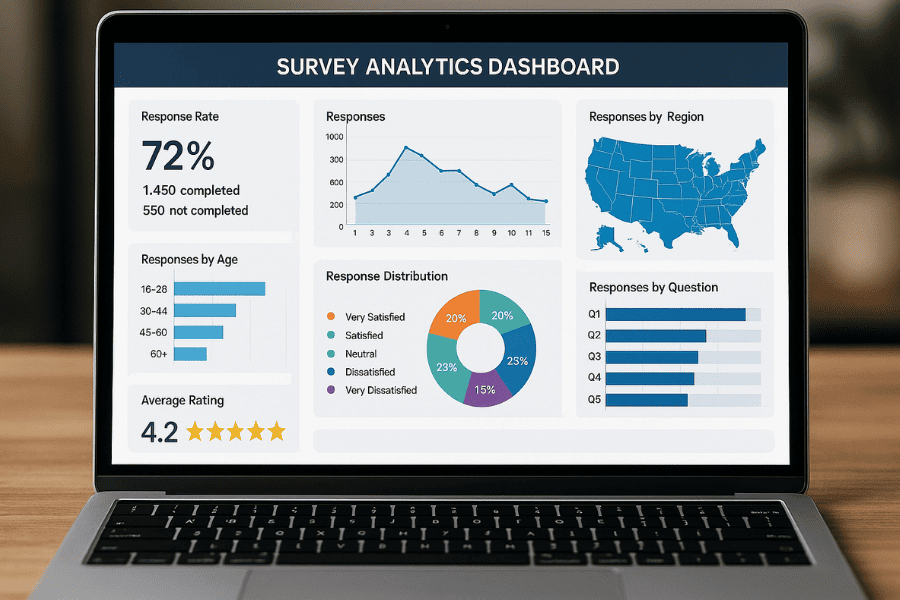
- Monitor completion rates
- Identify abandon points
- A/B test question order and types
Future of Mobile Surveys
The next wave of mobile surveys may include:
- Voice-based inputs
- Conversational interfaces (chatbot-style)
- Gesture-based interactions
- AI-driven real-time personalization
The future is interactive, intelligent, and user-focused.
Mobile Survey Best Practices
Designing for the thumb-first generation isn't just a trend, it's an essential strategy for engaging today’s mobile-centric audience. Whether collecting feedback, conducting research, or gathering opinions, your survey must meet users where they are, quite literally in their hands.
A mobile survey that respects the user's time, screen size, and habits will always outperform those built for desktops and shrunk down as an afterthought. Make the experience delightful, easy, and rewarding, and you'll not only gather better data but also build trust with your audience.
Frequently Asked Questions
Find answers to the most common questions about this topic
The thumb-first generation refers to mobile users who primarily interact with their devices using their thumbs, influencing how content and interfaces should be designed.
Most users access surveys through mobile devices. A mobile-optimized survey ensures higher engagement, faster completion, and better data accuracy.
Single choice, multiple choice, sliders, and rating scales are best for mobile due to their simplicity and thumb-friendliness.
Ideally under 5 minutes. Short, concise surveys prevent user drop-off and improve response quality.
Use device emulators and test on real smartphones to ensure responsive design, functionality, and a seamless user experience.
While possible, open-ended questions are less effective due to typing limitations on mobile. Use them sparingly and strategically.

Author
Bruma


